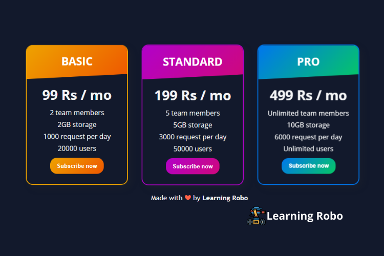
Hello developers, today in this blog you'll learn to create a Responsive Pricing Card Design using HTML & CSS with modern UI.
A pricing card is the flat card design of a particular product with its different prices and with different offers for the buyers. Pricing cards can be used for selling various products like laptops, computers, mobile phones, hosting, marketing, and others.
In this blog (Responsive Pricing Card Design), there are three pricing cards with different categories. These pricing cards are categorized based on the services provided by the company. There is a subscription button on the card. The hover effect has been used in every card and in the subscription button.
Every card has different categories and values for the same product based on the service provided by the company. Flex property has been used in this responsive pricing card design. This Pricing Card Design is fully responsive for any device. On the PC, these Pricing Card Design are horizontally visible, but on the mobile screen, these cards are vertically visible.
The source code of this Responsive Pricing Card Design using HTML & CSS is given below and we also provided the copy option of this program where you can easily copy the source code of this program. You can use this Responsive Pricing Card code with your creativity and can take this card to the next level.
Responsive Pricing Card Design using HTML & CSS with modern UI [Source Codes]
To make this website (Responsive Pricing Card Design), you need to create two files: an HTML file & a CSS file. First, create an HTML file with the name of index.html and remember, you have to create a file with a .html extension.
@import url("https://fonts.googleapis.com/css?family=Open+Sans:400,700&display=swap");

* {
  margin: 0;
  padding: 0;
  box-sizing: border-box;
}

html {
  font-size: 16px;
}
body {
background-color: #12192c;
  display: flex;
  justify-content: center;
  align-items: center;
  flex-direction: column;
  height: 100vh;
  line-height: 1.8;
  font-family: "Open Sans", sans-serif;
}
main {
  display: flex;
  justify-content: center;
  align-items: center;
  flex-wrap: wrap;
}
.card-basic,
.card-standard,
.card-premium {
  margin: 0 2rem 1rem 0;
  padding: 0 0 0.5rem 0;
  width: 15rem;
  background: #12192c;
  color: #f5f6f7;
  border:2px solid #eea300;
  border-top:none;
  text-align: center;
  border-radius: 1rem;
  box-shadow: 0.5rem 0.5rem 1rem rgba(51, 51, 51, 0.2);
  overflow: hidden;
  transition: all 0.1ms ease-in-out;
}
.card-basic:hover,
.card-standard:hover,
.card-premium:hover {
  transform: scale(1.02);
}
.card-header {
  height: 5rem;
  text-transform: uppercase;
  font-weight: 700;
  font-size: 0.8rem;
  padding: 1rem 0;
  color: #fff;
  clip-path: polygon(0 0, 100% 0%, 100% 85%, 0% 100%);
}
.header-basic,
.btn-basic {

  background: linear-gradient(135deg, #eea300, #ee5700);
}
.header-standard,
.btn-standard {
  background: linear-gradient(135deg, #b202c9, #cf087c);
}
.header-premium,
.btn-premium {
    background: linear-gradient(135deg, rgb(0, 119, 238), #06c766);
}
.card-body {
  padding: 0.5rem 0;
}
.card-body h2 {
  font-size: 2rem;
  font-weight: 700;
}
.card-element-container {
  color: #f5f6f7;
  list-style: none;
}
.btn {
  margin: 0.5rem 0;
  padding: 0.7rem 1rem;
  outline: none;
  border-radius: 1rem;
  font-weight: 700;
  color: #fff;
  border: none;
  cursor: pointer;
  transition: all 0.1ms ease-in-out;
}
.btn:hover {
  transform: scale(0.95);
}
.btn:active {
  transform: scale(1);
}
.card-element-hidden {
  display: none;
}

.credit{
    text-align: center;
    color: #f5f6f7;
    font-family: 'Trebuchet MS', 'Lucida Sans Unicode', 'Lucida Grande', 'Lucida Sans', Arial, sans-serif;
}

.credit a{
    text-decoration: none;
    color:#f5f6f7;
    font-weight: bold;
}
Thank you for reading our blog. If you face any problem in creating this Responsive Pricing Card Design using HTML & CSS with modern UI, then contact us or comment us. We’ll try to provide a solution to your problem as soon as possible.


Post a Comment
Thank you
Learning robo team