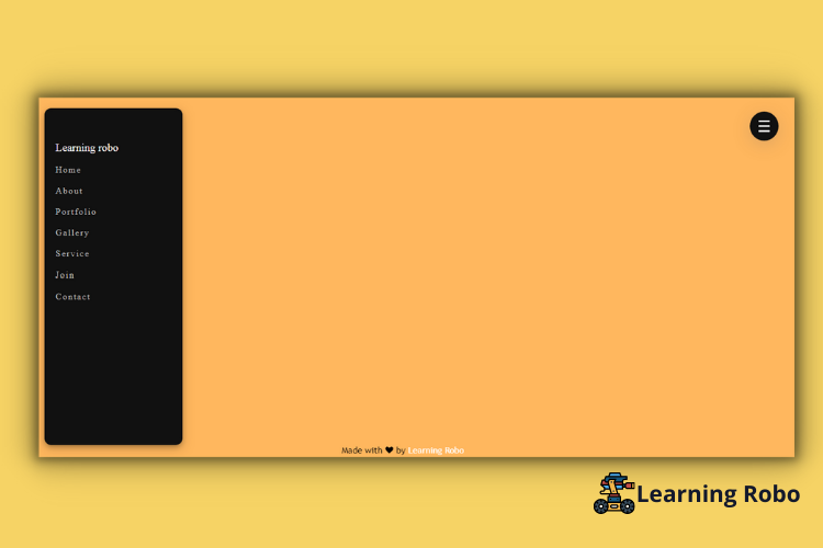
Hello developers, today in this blog you'll learn to create a Responsive Sidebar Menu using HTML, CSS & JavaScript.
The sidebar is the section on the website that is located
on either the right side or left side of the web page with some important
navigation links. The sidebar consists of several links which help the user to
redirect to that particular page. The sidebar is an essential part of the
web page. The sidebar menu can also be called a side navigation menu bar.
In this blog (Responsive Sidebar Menu), there is a bar at
the top right of the web page. On clicking the bar you can see the Sidebar
menu sliding from the left side of the web page. On this web page, the sidebar
menu consists of a Logo and some links. The hover effect has been used for
every link. When you hover on the links the position of the links or text will
slightly move towards the right side.
Again on clicking the bar which is present at the top
right of the web page, the sidebar will get disappear. This onClick function of
the bar is made by using JavaScript.
The source code of this Responsive Sidebar Menu is given
below, if you want the source code of this program, you can copy it. You can
use this Responsive Sidebar Menu with your creativity and can take this project
to the next level.
Responsive Sidebar Menu [Source Code]
To make this website, you would like to make three files: an HTML file, a CSS file & a JavaScript file. First, create an HTML file with the name of index.html and remember, you've to make a file with a .html extension.
CSS provides style to an HTML page. To make the page
attractive create a CSS file with the name style.css and remember that you've
got to make a file with a .css extension.
@import url('https://fonts.googleapis.com/css?family=Rubik&display=swap');

body{
   margin: 0;
   background: #FFB75E;
}
.sidebar{
   position: fixed;
   width: 250px;
   top: 0;
   left: -265px;
   bottom: 0;
   background: #111;
   padding-top: 50px;
   transition: 0.4s;
   height:85%;
   margin:auto 10px;
   border-radius: 12px;
   box-shadow: 0 4px 8px 0 rgba(0, 0, 0, 0.2), 0 6px 20px 0 rgba(0, 0, 0, 0.19);
}
.sidebar h1{
   display: block;
   padding: 10px 20px;
   color: #fff;
   text-decoration: none;
   font-family: "Rubik";
   font-weight: 400;
   margin: 0;
   font-size: 20px;
}
.sidebar a{
   display: block;
   padding: 10px 20px;
   color: #bbb;
   text-decoration: none;
   font-family: "Rubik";
   letter-spacing: 2px;
}
.sidebar a:hover{
   color: #fff;
   margin-left: 20px;
   transition: 0.4s;
}
button{
   position: fixed;
   right: 30px;
   top: 30px;
   background: #111;
   padding: 10px;
   border-radius: 2px;
   outline: none;
   border: none;
   border-radius: 50%;
   cursor: pointer;
   box-shadow: rgba(100, 100, 111, 0.2) 0px 7px 29px 0px;
}
button span{
   height: 3px;
   width: 20px;
   display: block;
   margin: 6px;
   background: #FFF;
}
.show{
   left: 0;
}
.credit{
    position:fixed;
    left:40%;
    bottom:0;
    color: #000;
    padding-bottom:5px;
    font-family: 'Trebuchet MS', 'Lucida Sans Unicode', 'Lucida Grande', 'Lucida Sans', Arial, sans-serif;
}
.credit >a{
    text-decoration: none;
    color:white
}
JavaScript makes the page work functionally. At last, create a JavaScript file with the name of script.js, and remember that you've got to make a file with a .js extension.
We hope you would like this Responsive Sidebar Menu using HTML, CSS & JavaScript.
Thank you for reading our blog. If you face any problem in creating this Responsive Sidebar Menu using HTML, CSS & JavaScript, then contact us or comment us. We’ll try to provide a solution to your problem as soon as possible.


Post a Comment
Thank you
Learning robo team