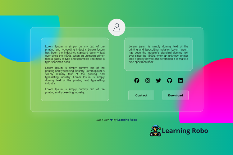
Hello developers, today in this blog you'll learn to create a Responsive Glassmorphism Profile Card Design using HTML & CSS.
A profile card contains the person’s details like photo, some descriptions of the person, some social media icons like Facebook, Twitter, Instagram, and LinkedIn to contact them. A profile card is used as an identity of a specific person. By placing the profile card on the web page, the user can contact the person easily.
The glass effect has been used in this profile card. The Glassmorphism is used to emphasizes light or dark objects, placed on top of colorful backgrounds. CSS backdrop-filter property has been used to blur the background.
In this blog (Responsive Glassmorphism Profile Card Design), there is a card at the center of the page with a person’s profile photo at the top center of the card and some description about the person. There are some social media icons to contact the person and also there are two buttons below to the social media icons such as contact and download. This Responsive Glassmorphism Profile Card Design is made responsive by using the media query property.
The source code of this Responsive Glassmorphism Profile Card Design is given below, if you want the source code of this program, you can copy it. You can use this Responsive Glassmorphism Profile Card Design code with your creativity and can take this profile card to the next level.
Responsive Glassmorphism Profile Card Design [Source Code]
To make this website (Responsive Glassmorphism Profile Card Design), you need to create two files: an HTML file and a CSS file. First, create an HTML file with the name of index.html and remember, you have to create a file with a .html extension.
@import url('https://fonts.googleapis.com/css2?family=Josefin+Slab:wght@100&display=swap');
*{
    box-sizing:border-box;
    font-family: arial;
}
body{
	display: flex;
	align-items: center;
	justify-content: center;
	flex-wrap: wrap;
	height: 100vh;
	background: linear-gradient(to right, #96c93d, #00b09b);
	color: #000;
}
body::before{
	content: "";
	position: absolute;
	left: 0;
	top: 0;
	height: 100%;
	width: 100%;
	clip-path: circle(30% at right 90%);
	background: linear-gradient(#f00,#f0f);
}
body::after{
	content: "";
	position: absolute;
	left: 0;
	top: 0;
	height: 100%;
	width: 100%;
	clip-path: circle(20% at 10% 10%);
	background-image: linear-gradient(to right top, #0b65ed, #009dff, #00c3e2, #00de86, #a8eb12);
}

.container{
	display: flex;
	align-items: center;
	justify-content: center;
	border-radius: 20px;
	min-height: 150px;
	margin: 0;
	max-width: 1000px;
	padding: 60px;
	box-shadow: 0 20px 50px rgba(255,255,255,0.15);
    background: rgba(255, 255, 255, 0.15);
    z-index: 10;
	backdrop-filter: blur(25px);
    border: 1px solid rgba(255,255,255,0.5);
    margin-top: 45px;
}
img{
	height: 100px;
	border-radius: 50px;
}
.photo{
	margin-top: -500px;
	display: flex;
	width: 100%;
	justify-content: center;
	position: absolute;
	z-index: 20;
}
.desc{
	border: 1px solid rgba(255,255,255,0.5);
	width: 45%;
	border-radius: 20px;
	padding: 25px;
	float: left;
	text-align: justify;
    text-justify: inter-word;
    background: rgba(255, 255, 255, 0.15);
}

.about{
	border: 1px solid rgba(255,255,255,0.5);
	width: 45%;
	border-radius: 20px;
	padding: 25px;
	float: right;
	text-align: justify;
    text-justify: inter-word;
    background: rgba(255, 255, 255, 0.15);
}

.social-icons{
	display: inline-flex;
	justify-content: space-around;
	align-content: space-between;
	width: 45%;
	float: right;
	padding: 40px;
}
.share-btn {
	cursor: pointer;
	font-size: 30px;
}
.buttons{
	display: inline-flex;
	justify-content: space-around;
	align-content: space-between;
	width: 45%;
	float: right;
}

.contact, .download{
	text-decoration: none;
	border: 1px solid rgba(255,255,255,0.5);
	text-align: center;
	border-radius: 5px;
	width: 150px;
    cursor: pointer;
    padding: 15px;
    font-weight: 900;
    cursor: pointer;
    color: #000;
    background: rgba(255, 255, 255, 0.15);
}
.credit{
    text-align: center;
    color: #000;
    font-family: 'Trebuchet MS', 'Lucida Sans Unicode', 'Lucida Grande', 'Lucida Sans', Arial, sans-serif;
    width: 100%;
}
.credit a{
    text-decoration: none;
    color: #072f5f;
    font-weight: bold;
}
@media(max-width: 850px){
	body{
		padding: 60px;
	}
	.desc{
		width: 100%;
		margin-bottom: 35px;
	}
	.about, .social-icons, .buttons{
		width: 100%;
	}
	.photo{
		margin-top:-370px;
	}
}
Thank you for reading our blog. If you face any problem in creating this Responsive Glassmorphism Profile Card Design using HTML & CSS, then contact us or comment us. We’ll try to provide a solution to your problem as soon as possible.


Post a Comment
Thank you
Learning robo team