Hello developers, today in this blog, you'll learn to create a Responsive Card Design using HTML & CSS.
A card is a UI design pattern that groups related information in a flexible-size container visually resembling a playing card. A card can contain information, images, hyperlinks, icons, and symbols are arranged or aligned for a better UI. A card design is used for advertising, highlighting, etc.
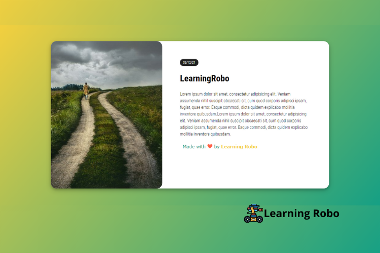
In this blog (Responsive Card Design) on the webpage, there is a card at the center of the page. The card contains the date and the information on the right side and an image on the left side. CSS Border-radius property has been used for both the image and the card. The linear color gradient has given as the background of the page. CSS layouts have been used for the alignment of the card.
The source code of this Responsive Card Design is given below, if you want the source code of this program, you can copy it. You can use this Responsive Card Design with your creativity and can take this project to the next level.
Responsive Card Design [Source Code]
To make this website, you would like to make two files: an HTML file & a CSS file. First, create an HTML file with the name of index.html and remember, you have to create a file with a .html extension.
@import url("https://fonts.googleapis.com/css2?family=Roboto+Condensed:wght@300;400;700&display=swap");
body,
html {
  min-height: 100vh;
  width: 100vw;
  display: flex;
  align-items: center;
  justify-content: center;
  font-size: 1em;
  line-height: 1.5;
  background: #18181b;
  font-family: "roboto condensed", sans-serif;
  font-weight: 300;
}
body .wrapper,
html .wrapper {
  max-width: 1000px;
}
body{
  background-color: #F4D03F;
background-image: linear-gradient(132deg, #F4D03F 0%, #16A085 100%);

}
.side-image {
  background: #fff;
  border-radius: 20px;
  box-shadow: 0 4px 8px 0 rgba(0, 0, 0, 0.2), 0 6px 20px 0 rgba(0, 0, 0, 0.19);
}
@media (min-width: 992px) {
  .side-image {
    display: grid;
    grid-template-columns: 400px 1.3fr;
    grid-template-rows: 1fr;
    gap: 0px 0px;
    grid-template-areas: ". .";
  }
}
.side-image .images-wrapper {
  display: block;
  min-height: 12em;
  padding: 3em;
  border-radius: 20px;
}
.side-image .side-image-content {
  padding: 3em 1em 2em 1em;
}
@media (min-width: 992px) {
  .side-image .side-image-content {
    padding: 4em 4em 8em 4em;
  }
}
.side-image .side-image-content .kicker {
  background: #222;
  color: white;
  font-size: 0.75em;
  margin-bottom: 1.3em;
  padding: 5px 11px;
  text-transform: uppercase;
  border-radius: 10px;
}
.credit a{
  text-decoration: none;
  color: #F4D03F;
  font-weight: 800;
  }

  .credit {
    font-family: Verdana, Geneva, Tahoma, sans-serif;
    margin: 10px;
    color:#16A085
  }
Thank you for reading our blog. If you face any problem in creating this Responsive Card Design using HTML & CSS, then contact us or comment us. We’ll try to provide a solution to your problem as soon as possible.


Post a Comment
Thank you
Learning robo team