Hello developers, today in this blog you'll learn how to create a Responsive Card Design with Hover Effect using HTML & CSS.
The card design can be a convenient means of displaying contents that include various information pictures or icons of the particular information that what has to be displayed or conveyed, title and description.
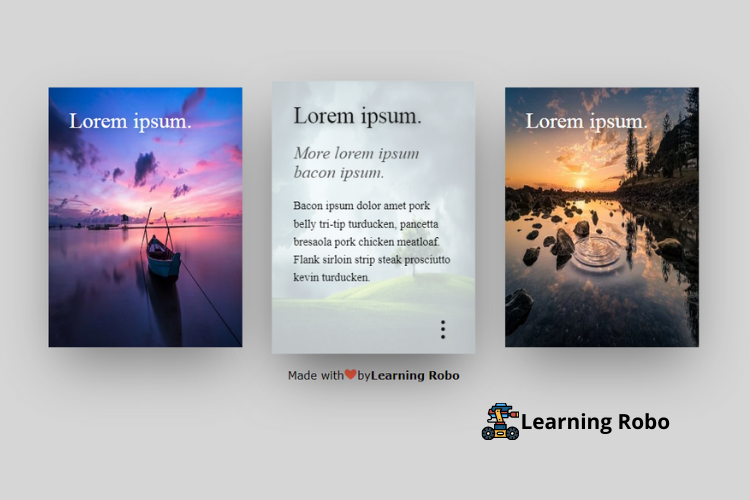
In this blog (Responsive Card Design with Hover Effect) on the webpage, there are three cards, each card contains an image with its title. When you hover over the card, the card displays the subtitle and description where the image is hidden by using the opacity property. The subtitle and the description slide from the right and left of the card when hovering over the card.
This card is made responsive by using the CSS media query property. When you view this page on a larger screen, the cards are arranged horizontally, whereas on the smaller screen the cards are arranged vertically that is one by one.
The source code of this Responsive Card Design with Hover Effect is given below, and you can copy the source code of this program. You can use this code of Responsive Card Design with Hover Effect with your creativity and can take this card to the subsequent level.
Responsive Card Design with Hover Effect [Source Code]
To make this website (Responsive Card Design with Hover Effect), you need to create two files: an HTML file & a CSS file. First, create an HTML file with the name of index.html and remember, you have to create a file with a .html extension.
body
{
  background-color: #d6d6d6;
}
.wrap
{
  margin:50px auto 0 auto;
  width:100%;
  display:flex;
  align-items:space-around;
  max-width:1000px;
}
.card
{
  width:380px;
  height:380px;
  margin:25px;
  background-color:#F5FCFF;
  display:inline-block;
  background-size:cover;
  position:relative;
  cursor:pointer;
  transition: all 0.4s ease-out;
  box-shadow: 0px 35px 77px -17px rgba(0,0,0,0.44);
  overflow:hidden;
  color:white;
  font-family:'Roboto';

}
.card img
{
  height:100%;
  width:100%;
  position:absolute;
  top:0;
  left:0;
  z-index:0;
  transition: all 0.4s ease-out;
}
.card .text
{
  position:absolute;
  padding:30px;
  height:calc(100% - 60px);
}
.card h1
{

  font-weight:300;
  margin:0;
  text-shadow: 2px 2px 10px rgba(0,0,0,0.3);
}
.card h2
{
  font-weight:100;
  margin:20px 0 0 0;
  font-style:italic;
   transform: translateX(200px);
}
.card p
{
  font-weight:300;
  margin:20px 0 0 0;
  line-height: 25px;
  transform: translateX(-200px);
  transition-delay: 0.2s;
}
.animate-text
{
  opacity:0;
  transition: all 0.6s ease-in-out;
}
.card:hover
{
color: #000;
box-shadow: 0px 35px 77px -17px rgba(0,0,0,0.64);
  transform:scale(1.05);
}
.card:hover img
{
  opacity: 0.2;
}
.card:hover .animate-text
{
  transform:translateX(0);
  opacity:1;
}
.dots
{
  position:absolute;
  bottom:20px;
  right:30px;
  margin: 0 auto;
  width:30px;
  height:30px;
  color:currentColor;
  display:flex;
  flex-direction:column;
  align-items:center;
  justify-content:space-around;
}

.dots span
{
  width: 5px;
  height:5px;
  background-color: currentColor;
  border-radius: 50%;
  display:block;
  opacity:0;
  transition: transform 0.4s ease-out, opacity 0.5s ease;
  transform: translateY(30px);
}

.card:hover span
{
  opacity:1;
  transform:translateY(0px);
}

.dots span:nth-child(1)
{
   transition-delay: 0.05s;
}
.dots span:nth-child(2)
{
   transition-delay: 0.1s;
}
.dots span:nth-child(3)
{
   transition-delay: 0.15s;
}


@media (max-width: 1000px) {
  .wrap {
   flex-direction: column;
    width:400px;
  }
}
.credit a {
    text-decoration: none;
    color: #000;
    font-weight: 800;
}

.credit {
    text-align: center;
    font-family: Verdana,Geneva,Tahoma,sans-serif;
}
Thank you for reading our blog. If you face any problem in creating this Responsive Card Design with Hover Effect using HTML & CSS, then contact us or comment us. We’ll try to provide a solution to your problem as soon as possible.


Post a Comment
Thank you
Learning robo team