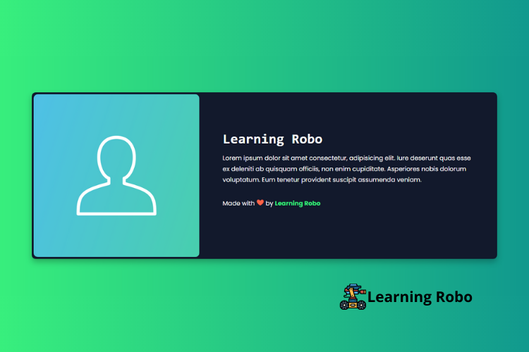
Hello developers, today in this blog you'll learn to create a Responsive About Card with Flexbox Animation using HTML & CSS.
About page, the page says a lot about the person like profile of the person, name and some description of the person. The design of the website’s about page is a visual reflection of the person. It’s an opportunity to increase the interest of site visitors.
On this website (Responsive About Card with Flexbox Animation), there is a photo or icon of the person on the left side of the card with some information about the person like name and some information of the person on the right side of the card.
This Responsive About Card with Flexbox Animation Page is made responsive by using CSS media query property. On PC, the photo or icon and the other details are aligned horizontally. But on the smaller screen, they are aligned vertically or one by one.
The source code of this Responsive About Card with Flexbox Animation using HTML & CSS is given below, if you want the source code of this program, you can copy it. You can use this Responsive About Card with Flexbox Animation code on your projects.
Responsive About Card with Flexbox Animation[Source Code]
To make this website, you would like to make two files: an HTML file & a CSS file. First, create an HTML file with the name of index.html and remember, you've to make a file with a .html extension.
@import url("https://fonts.googleapis.com/css?family=Poppins:400,400i,500,600,700&display=swap");
* {
  transition: 0.33 ease all;
  box-sizing: border-box;
}
body {
  margin: 0;
  padding: 0;
  background: #11998e;
  background: -webkit-linear-gradient(to right, #38ef7d, #11998e);
  background: linear-gradient(to right, #38ef7d, #11998e);
}
html {
  font-family: "Poppins", sans-serif;
  box-sizing: border-box;
}
div.main {
  height: 100vh;
  display: flex;
  align-items: center;
  background: #11998e;
  background: -webkit-linear-gradient(to right, #38ef7d, #11998e);
  background: linear-gradient(to right, #38ef7d, #11998e);
  justify-content: center;
}
div.container {
  background: #12192c;
  display: flex;
  flex-direction: column;
  align-items: center;
  justify-content: center;
  margin: 30px;
  box-shadow: 0 8px 16px rgba(0, 0, 0, 0.25);
  color:#fff;
  padding: 5px;
  border-radius: 10px;
}
.imag {
  width: 100%;
}
h1 {
  font-weight: 600;
  font-size: 36px;
  margin: 0 0 15px;
  font-family: monospace;
}
p {
  font-weight: 300;
  line-height: 28px;
  margin: 0 0 30px 0;
}
div.imag {
  height: 300px;
  width: 100%;
  background: url("https://cdn.pixabay.com/photo/2017/07/18/23/23/user-2517433__480.png");
  background-size: cover;
  background-position: center;
  border-radius: 10px;
}
div.text-container {
  margin: 60px 45px 55px;
}
@media screen and (min-width: 768px) {
  div.container {
    width: 100%;
    flex-direction: row;
  }
  div.imag {
    min-width: 360px;
    height: 420px;
  }
  div.text-container {
    margin: 0 60px;
    max-width: 660px;
  }
}
@media screen and (min-width: 1024px) {
  div.container {
    max-width: 1200px;
  }
}
.credit a{
  text-decoration: none;
  color: #38ef7d;
  font-weight: 800;
}
.credit {
    margin-top: 10px;
}
Thank you for reading our blog. If you face any problem in creating this Responsive About Card with Flexbox Animation using HTML & CSS, then contact us or comment us. We’ll try to provide a solution to your problem as soon as possible.


إرسال تعليق
Thank you
Learning robo team