Hello developers, today in this blog, you'll learn to create a Responsive Profile Card Slider using HTML & CSS.
A profile card contains the person’s details like photo, name, contact icons, designation and their rating to the destination, and some other information about the person. A profile card is used as an identity of a specific person. By placing the profile card on the web page, the user can contact the person easily. The Card Slider may be the convenient way to display the changing or sliding cards one by one on your website. Card slider or slideshow commonly shows one large image at a time with a little scrap of text, at the bottom of the image. In the card Slider, the cards will slide one by one when the button is clicked, manually.
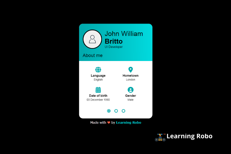
In this blog(Responsive Profile Card Slider), there is a card at the center of the webpage, which contains the profile icon of the person, name, and designation. Below there details, there is an about me that is about the person like gender, date of birth, hometown. This card can slide manually, by clicking on the dotted buttons on the bottom of the card. When you slide to the second card, it will display the skills of the person. By sliding to the next card, it will you to the contacts of the person. You can add as many slides as you need. This page is made responsive by using the CSS media query property.
The source code of this Responsive Profile Card Slider is given below, if you want the source code of this program, you can copy it. You can use this Responsive Profile Card Slider on your project.
Responsive Profile Card Slider [Source Code]
To make this website, you would like to make two files: an HTML file & a CSS file. First, create an HTML file with the name of index.html and remember, you have to create a file with a .html extension.
.usercard{
  box-sizing: border-box;
  display: flex;
  box-shadow: 0 2px 2px 0 rgba(0, 0, 0, 0.14), 0 1px 5px 0 rgba(0, 0, 0, 0.12), 0 3px 1px -2px rgba(0, 0, 0, 0.2);
  flex-direction: column;
  background-color: #fff;
  margin: 2rem auto 1rem;
  position: relative;
  z-index: 5;
  border-radius: 20px;
}

@media screen and (min-width: 641px){

  .usercard{
    width: 38rem;
  }
}

@media screen and (max-width: 640px){

  .usercard{
    width: 90%;
  }
}

.usercard_body{
  padding-bottom: 2rem;
  flex-grow: 2;
  color: #000;
}

.usercard_header{
  padding: 3rem 5% 2rem;
  display: flex;
  align-items: center;
  background-image: linear-gradient(to right, #01a9ac, #01dbdf);
  color: #000;
  border-top-right-radius: 20px;
  border-top-left-radius: 20px;
}

.usercard_user{
  border-radius: 50%;
  border: 4px solid #000;
  box-sizing: border-box;
  margin-right: 4%;
  width: 10rem;
  height: 10rem;
}

.usercard_name{
  font-size: 3.5rem;
  font-weight: 300;
  margin-top: 0;
  margin-bottom: 0;
}

.usercard_name-label{
  font-weight: 700;
}

.usercard_post{
  display: block;
}

.usercard_title{
  padding: 0 5% 1.5rem;
  margin-top: 0;
  margin-bottom: 3rem;
  font-size: 2.4rem;
  font-weight: 300;
  color: #000;
  background: linear-gradient(to right, #01a9ac, #01dbdf);
}

.stats{
  box-sizing: border-box;
  font-size: 1.4rem;
}

.stats_name, .stats_value{
  display: block;
  word-break: break-all;
}

.stats_value{
  text-decoration: none;
  color: inherit;
  margin-top: .2em;
}

.usercard_stats{
  padding-right: 4%;
  padding-left: 4%;
  text-align: center;
  display: flex;
  flex-wrap: wrap;
  justify-content: flex-start;
  align-items: flex-start;
}

.usercard_stats-item{
  width: 48%;
  margin-top: 3rem;
}

.usercard_stats-item:first-child,
.usercard_stats-item:nth-child(2){
  margin-top: 0;
}

.usercard_stats-info{
  margin-top: .7rem;
}

.usercard_stats-name{
  font-weight: 700;
  font-size: 1.6rem;
}

.slider{
  position: relative;
  overflow: hidden;
  box-sizing: border-box;
  height: 32rem;
}

.slider_slides{
  height: 100%;
  transform: translate3d(0, 0, 0);
  transition: transform .4s;
}

.slider_slide{
  position: absolute;
  width: 100%;
  height: 100%;
  top: 0;
}

.slider_slide:nth-of-type(1){
  left: 0;
}

.slider_slide:nth-of-type(2){
  left: 100%;
}

.slider_slide:nth-of-type(3){
  left: 200%;
}

.slider_control{
  width: 1.2rem;
  height: 1.2rem;
  display: block;
  border-radius: 50%;
  cursor: pointer;
  text-indent: -9999px;
  position: absolute;
  z-index: 3;
}

.usercard_switch{
  position: absolute;
  top: 0;
  left: -9999px;
}

.slider_switch:nth-of-type(1):checked ~ .slider_slides{
  transform: translate3d(0%, 0, 0);
}

.slider_switch:nth-of-type(2):checked ~ .slider_slides{
  transform: translate3d(-100%, 0, 0);
}

.slider_switch:nth-of-type(3):checked ~ .slider_slides{
  transform: translate3d(-200%, 0, 0);
}

.usercard_switch:checked + .slider_control:before{
  transform: scale(0.7) translateZ(0);
}

.usercard_control{
  border: 3px solid #01a9ac;
  overflow: hidden;
  position: absolute;
  margin-left: -.75rem;
  bottom: 1rem;
  z-index: 2;
  display: flex;
  justify-content: center;
  align-items: center;
  transform: translateZ(0);
}

.usercard_control:before{
  content: "";
  display: block;
  width: 100%;
  height: 100%;
  border-radius: 50%;
  transform: scale(0) translateZ(0);
  background-color: #01a9ac;
  transition: transform .2s ease-out;
}

.usercard_control:nth-of-type(1){
  left: 40%;
}

.usercard_control:nth-of-type(2){
  left: 50%;
}

.usercard_control:nth-of-type(3){
  left: 60%;
}

/*
* demo styles
*/

@media screen and (min-width: 981px){

  html{
    font-size: 62.5%;
  }
}

@media screen and (min-width: 641px) and (max-width: 980px){

  html{
    font-size: 9px;
  }
}

@media screen and (max-width: 640px){

  html{
    font-size: 8px;
  }
}

body{
  font-family: "Roboto", "Arial", sans-serif;
  font-size: 1.6rem;
  color: #fff;
  margin: 0;
  min-height: 100vh;
  overflow: hidden;
  background: #000;
}
i{
  color: #01a9ac;
  font-size: 30px;
}
a{
  color: inherit;
  text-decoration: none;
}
.credit a{
    text-decoration: none;
    font-weight: 800;
    color: #01dbdf;
}
.credit {
    text-align: center;
    font-family: Verdana, Geneva, Tahoma, sans-serif;
    color: #fff;
}
Thank you for reading our blog. If you face any problem creating this Responsive Profile Card Slider using HTML & CSS, then contact us or comment us. We'll try to provide a solution to your problem as soon as possible.


إرسال تعليق
Thank you
Learning robo team